Designing the identity of a beach bar for chill afternoons and warm nights by the sea
Casa Coco is a beach bar that's all about chill vibes.
It’s the kind of place you stay longer than planned, where the breeze is soft, the cocktails are good, and the vibe is made for young social adults.
The aim of this collaboration went beyond just a logo; it was about channelling Casa Coco’s ethos into a visual identity that feels relaxed, warm, and free.


Finding perfection in the imperfect
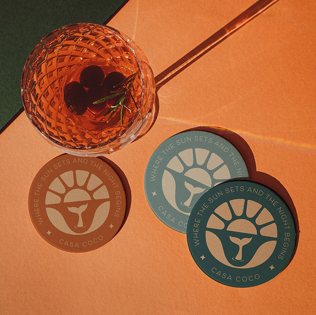
My approach was a logo mark that had 2 main elements:
The Sunset represents the golden hour — that perfect moment of connection, calm, and cocktails. It speaks to Casa Coco’s core experience: unwinding with friends as the sky fades into fire.
The Mermaid Tail that's emerging adds a layer of magic, escapism, and coastal playfulness. It evokes the spirit of the ocean — wild, free, and a little mythical — echoing the carefree vibe that defines every visit to Casa Coco.
If you pay close attention, even the badge that makes all off it come together isn't a perfect circle. That was intentional.
A perfect shape can feel rigid, polished, and formal, qualities that don’t align with the relaxed, easygoing personality of this beach bar.
Instead, this more organic, slightly imperfect badge evokes a sense of warmth, authenticity, and natural flow—just like the ocean, just like the bar.
It mirrors the brand's laid-back spirit, where things don’t have to be perfect to feel just right.
The handwritten font was chosen to reflect the bar’s laid-back and approachable personality.
Unlike structured or geometric typefaces, a handwritten font feels more organic, human, and personal—like a note scribbled on a napkin or a sign at a beach shack.
It communicates that this is not a polished, corporate place—it’s a warm, casual spot where people can unwind, be themselves, and enjoy the moment.